Building Framework-Agnostic Web Components with Svelte 5

One of the trickiest parts of scaling a component library is portability. If you build a button in Svelte, it works beautifully in Svelte apps. Put it in a React project? You hit a wall. Vue? Same problem. Each framework has its own way of thinking about components, and reconciling that across ecosystems feels like learning a new language for every team.
Svelte 5 changed that. The framework now has first-class support for Web Components via the customElement directive, which means you can write a component once and drop it into React, Vue, Angular, plain HTML, or any other environment without adaptation. No wrapper, no plugin, no headache.
I've built three component libraries in the past three years, and the shift to Web Components solved the biggest complaint I got from users: "Can I use this outside Svelte?" The answer used to be no, or "sort of, with effort." Now it's yes.
Link to section: Why This Matters Right NowWhy This Matters Right Now
Web Components aren't new. The spec has been stable for years. But Svelte 5's implementation makes them genuinely practical for production. The Svelte compiler handles the boilerplate, slot passing, reactive prop updates, and event dispatch without you writing a single line of imperative DOM code. You write Svelte. It becomes a Web Component. Done.
The timing also aligns with a shift in how companies build. Monorepos with multiple frontends (a React dashboard here, a Vue landing page there, a Svelte internal tool over there) are standard now. A shared component layer that doesn't impose framework choice becomes invaluable. I've seen teams go from "we need to maintain this button three times" to "we maintain it once, and everyone uses it."
That said, Web Components do have trade-offs. They're not a magic bullet for every use case. I'll walk through when they shine and when you should probably stick with framework-specific components.
Link to section: Setting Up Your First Web ComponentSetting Up Your First Web Component
Start by creating a new Svelte component. I'll use a practical example: a notification alert that can appear in any app.
<script>
  let { type = 'info', title, description, dismissible = true } = $props();
  let visible = $state(true);

  const close = () => {
    visible = false;
  };
</script>

<svelte:options customElement="my-alert" />

{#if visible}
  <div class="alert alert-{type}">
    <div class="alert-header">
      <h3>{title}</h3>
      {#if dismissible}
        <button onclick={close} class="close-btn">×</button>
      {/if}
    </div>
    <p>{description}</p>
  </div>
{/if}

<style>
  .alert {
    padding: 1rem;
    border-radius: 8px;
    border-left: 4px solid;
    margin-bottom: 1rem;
  }

  .alert-info {
    background: #e3f2fd;
    border-color: #2196f3;
  }

  .alert-warning {
    background: #fff3e0;
    border-color: #ff9800;
  }

  .alert-error {
    background: #ffebee;
    border-color: #f44336;
  }

  .alert-header {
    display: flex;
    justify-content: space-between;
    align-items: center;
  }

  h3 {
    margin: 0;
    font-size: 1rem;
  }

  .close-btn {
    background: none;
    border: none;
    cursor: pointer;
    font-size: 1.5rem;
    padding: 0;
  }
</style>
The key line is <svelte:options customElement="my-alert" />. This tells the Svelte compiler to generate a Web Component with the tag name my-alert. When you build this, Svelte creates a JavaScript file that registers the custom element automatically.
Now you can use it anywhere HTML is served:
<!-- Plain HTML, no build step needed -->
<my-alert
  type="warning"
  title="Heads up"
  description="This action cannot be undone">
</my-alert>

<!-- React (no special wrapper) -->
function MyApp() {
  return <my-alert type="info" title="Hello" description="From React" />;
}

<!-- Vue -->
<template>
  <my-alert type="error" title="Oops" description="Something broke" />
</template>
That's it. The component works everywhere because Web Components are a browser standard, not a framework feature.
Link to section: Props, Events, and the Shadow DOMProps, Events, and the Shadow DOM
Svelte 5's $props() directive makes prop binding straightforward. Each prop you destructure becomes an accessible property on the custom element. The framework automatically handles reactivity: if you update a prop from outside, the component re-renders.
For event communication, use the host rune to get a reference to the host element, then dispatch custom events:
<script>
  let { onDismiss } = $props();
  const host = $host();

  const notifyDismiss = () => {
    host.dispatchEvent(new CustomEvent('dismiss', {
      detail: { timestamp: Date.now() }
    }));
  };
</script>
Then, from React, Vue, or anywhere else:
<my-alert id="alert-1"></my-alert>

<script>
  const alertEl = document.getElementById('alert-1');
  alertEl.addEventListener('dismiss', (e) => {
    console.log('Alert dismissed at', e.detail.timestamp);
  });
</script>
By default, Svelte Web Components use the Shadow DOM, which automatically scopes styles. This means your component's CSS won't leak out, and external styles won't break your component. You can opt out with <svelte:options customElement={{ shadow: false }} /> if you need global style access, but I'd avoid it unless you have a strong reason.
Link to section: TypeScript and Prop ValidationTypeScript and Prop Validation
If your component is built with TypeScript, Svelte automatically infers the custom element interface. Add a svelte.d.ts file at the root of your component directory:
declare namespace svelte.JSX {
  interface IntrinsicElements {
    'my-alert': {
      type?: 'info' | 'warning' | 'error';
      title?: string;
      description?: string;
      dismissible?: boolean;
      ondismiss?: (event: CustomEvent) => void;
    };
  }
}
This gives TypeScript and editor autocompletion the exact props and events your component accepts. React developers can use @types/react-dom with an ambient declaration; Vue picks up the types automatically if you export them.
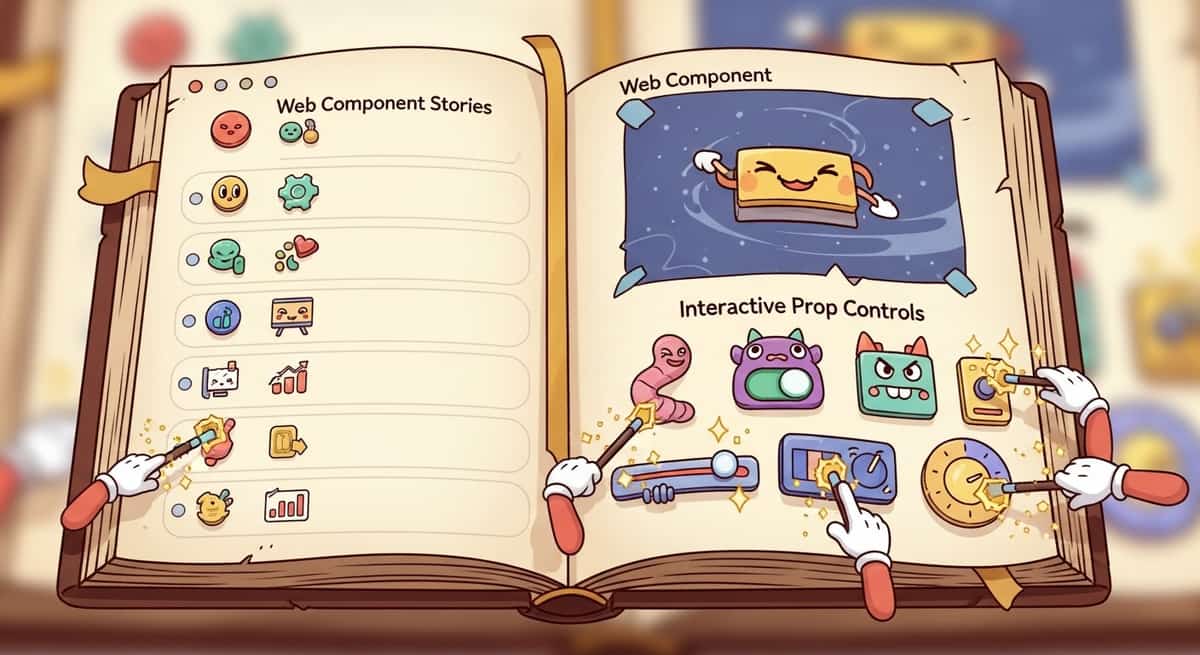
Link to section: Documenting with StorybookDocumenting with Storybook
The real payoff comes when you add Storybook. A story file for your Web Component looks nearly identical to a framework-specific story, but it becomes your single source of truth for how the component works.
import type { Meta, StoryObj } from '@storybook/web-components';
import { html } from 'lit';
import './my-alert.js'; // Import the built component

const meta: Meta = {
  title: 'Alert',
  component: 'my-alert',
  tags: ['autodocs'],
};

export default meta;
type Story = StoryObj;

export const Info: Story = {
  render: () => html`
    <my-alert
      type="info"
      title="Heads up"
      description="This is an informational message">
    </my-alert>
  `,
};

export const Warning: Story = {
  render: () => html`
    <my-alert
      type="warning"
      title="Warning"
      description="This action requires confirmation">
    </my-alert>
  `,
};

export const Error: Story = {
  render: () => html`
    <my-alert
      type="error"
      title="Error"
      description="Something went wrong. Please try again later.">
    </my-alert>
  `,
};
Storybook will render each story as a real Web Component in the browser. You get interactive docs, prop controls, accessibility checks, and even visual regression testing. The same documentation works for React, Vue, and vanilla JavaScript teams. No duplication.
Link to section: Publishing to npmPublishing to npm
When you're ready to share, build the component and publish it to npm like any other package. Your package.json should include a pointer to the built file:
{
  "name": "@yourorg/shared-components",
  "version": "1.0.0",
  "main": "dist/index.js",
  "exports": {
    ".": {
      "default": "./dist/index.js"
    },
    "./my-alert": "./dist/my-alert.js"
  },
  "types": "dist/index.d.ts"
}
Users install your package and either import the component globally or lazily:
// Global import (all components loaded)
import '@yourorg/shared-components';

// Lazy import (only my-alert)
import '@yourorg/shared-components/my-alert';
Link to section: Trade-offs and When Not to Use Web ComponentsTrade-offs and When Not to Use Web Components
Web Components shine for low-level, reusable UI elements: buttons, inputs, alerts, modals, cards. They also work well for components that span multiple teams or frameworks.
Where they falter: complex, data-heavy components that rely heavily on framework state management. A data table with sorting, filtering, and inline editing is simpler to build as a React component (using hooks) or a Svelte component (using stores) than as a Web Component, because you'd have to manually manage state through events and attributes. That said, if you keep the Web Component simple and let the parent framework handle logic, it can work.
Another consideration is bundle size. A Web Component includes its own Svelte runtime (unless you deduplicate across components). If your app already includes React or Vue, adding a Web Component means a few extra kilobytes. For single-purpose libraries (a button pack, an icon set), it's negligible. For large, complex systems, you might want framework-specific builds alongside the Web Component version.
Browser support is solid on modern browsers. If you need to support IE11 or older mobile browsers, you'll need polyfills, which adds overhead. For most production apps targeting 2024+ browsers, you're fine.
Link to section: A Real-World ScenarioA Real-World Scenario
I worked on a project where three teams needed a shared progress indicator. The React team wanted a hook, Vue wanted a composable, and Svelte wanted a store. Instead of building it three times, we built it once as a Web Component with TypeScript types. Each team wrapped it in their preferred pattern (a React hook that renders the component, a Vue composable that does the same, a Svelte store exporting the component). Total time: a few hours instead of a few days. No more "oops, I fixed the bug in React but forgot to update Vue." One bug fix, three teams benefit.
Link to section: Getting StartedGetting Started
If you want to ship a Web Component from your Svelte 5 app today:
- Create a
.sveltefile with<svelte:options customElement="my-component" />. - Build it with
npm run build(your build tool will generate the custom element). - Import it in your main HTML or bundle it with your library.
- Use it in any framework or plain HTML.
Consider starting with a small, well-tested component (a button, badge, or icon) to validate the approach before scaling to larger ones. The learning curve is shallow, and the payoff compounds when multiple teams need the same behavior.
Web Components aren't a replacement for framework-specific components in all contexts. But for libraries that need to work everywhere, Svelte 5's implementation is genuinely production-ready now. I'd recommend exploring it if you're managing shared component code across teams or planning a public component library.

